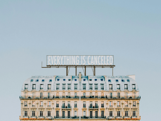
You rely on major ticketing platforms for sales, but still invest heavily in event marketing to promote your brand? Admittedly, many visitors purchase their tickets with well-known retailers. The real question is: do potential customers randomly stumble upon your event there, or do you guide them directly to that platform through your marketing links? The difference isn’t trivial, especially considering the high sales commissions you pay your ticketing partner. That’s why you should critically reassess your sales structure. This article shares what we’ve learned about event marketing with your own brand.
Insights into the ticketing industry in the podcast “Dirk Kreuter & Friends”
Tune in to hear what’s going wrong in the ticketing business—and how Sven Müller and his team plan to change the industry.
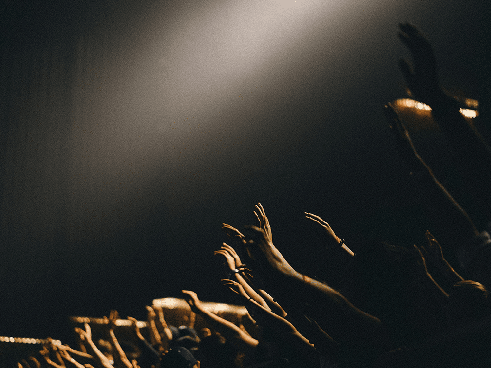
Whether it’s sports, culture, or entertainment—ticketing is the part of any event that brings in revenue and keeps your operations running. One of the key questions every organizer regularly asks: How do I reach more people to sell more tickets? To gain more visibility, many invest heavily in marketing campaigns, only to give up to 20% of their ticket revenue as distribution fees to ticket portals. A traditional entrepreneur would find this absurd. Renowned German business coach Dirk Kreuter even calls sales a core competence of every business—so what is an event organizer, if not a business owner? The only difference is the product.
The fear of limited reach
The reason why organizers and artists often delegate their ticketing to large platforms is most likely the fear of not having enough reach to sell sufficient tickets. However, many overlook the fact that—even without active ad campaigns—the growing quality of their shows, fan engagement, newsletters, email marketing, and their content on websites and social media are already strong drivers for ticket sales. Every Instagram post and member campaign helps clubs, artists, and theaters increase their reach, customer loyalty, and repeat ticket sales—while investing time, money, and manpower. And that’s not wrong—quite the opposite! But while you build your brand with blood, sweat, and tears, your ticket portal merely mentions your event alongside direct competitors in a newsletter that might just end up in the spam folder.
Who really drives the purchase?
Let’s continue this example. A customer of your ticket portal receives a newsletter with event recommendations based on past purchases. They skim through offers and pause at your event. They’re interested—but will they actually buy?
In marketing literature, this process is described by the AIDA model: Attention, Interest, Desire, Action. In this case, the initial attention comes from the portal’s newsletter. But the rest—interest, desire, and the final decision—is up to you: your texts, visuals, and brand reputation. Your brand creates the connection, convinces with value, and triggers the purchase. And often, you’re even responsible for the first step—A for Attention—when you distribute flyers, run ads, or maintain communication channels. You’re not entirely reliant on big platforms—but they still charge you for the publicity.
Especially around the holiday season, users browse portals for gift ideas. But is this the reality for most ticket sales? Not really. In live entertainment or major sports events, fans typically discover new events via Instagram or your website. These channels include direct links to the official ticket shop. Users follow those links—land on the ticket platform—where additional fees await them. And you? You see nothing from that fee. Quite the opposite—you’re being charged for the “distribution,” even though you did all the work.
Case Study: Brand vs. Platform
Our stance is clear: You bring more buyers to the platform through your brand than the platform brings to your event. And we’re not just talking theory—we’ve lived it.
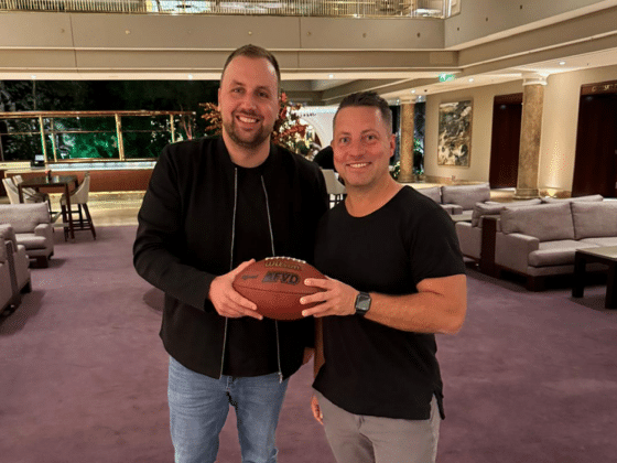
On the popular sales podcast “Dirk Kreuter & Friends,” egocentric Systems CEO Sven Müller shares a memorable experience that affirms our philosophy:
It was a Friday afternoon a few years ago, right before Christmas. Our CEO Sven Müller was returning from a client meeting by train. Due to poor mobile reception, he didn’t notice the flood of missed calls from various numbers. Upon calling back, he learned they were from the management and artist of a new client.
The musician was interested in their own ticket shop but hesitant, as egocentric Systems was still new at the time. So they split the sales: 50% through their own shop and 50% via a major ticket portal. Müller suggested that the artist initially only promote the direct shop link via their own channels.
Sales launched that Friday. Soon after, the management was panicking: “What’s going on? We went live 30 minutes ago, and no one can buy from your shop! We linked to your site, but only the portal still has tickets! We trusted you!”
Panic set in. Müller rushed to the office, adrenaline pumping. Once there, the team checked everything. Then they smiled and said:
“What problem? We’ve been sold out for 20 minutes.”
Monopolies, Power & Data
Hear more powerful insights from egocentric Systems CEO Sven Müller in his podcast interview with sales expert Dirk Kreuter.
Conclusion: Your brand is the real driver
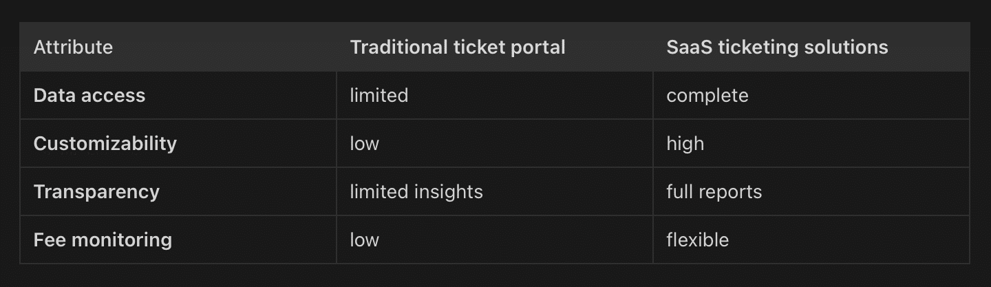
Ticket sales are more than just having a listing on a platform. Many organizers underestimate the influence of their brand—and end up paying twice to promote their own events. The bigger your following and reach, the more you should consider whether a dedicated ticket shop is the smarter choice.
As shown in our example, choosing a sales channel doesn’t have to be all or nothing. Skeptical? Try what our client did—split the ticket allotment. This hybrid model works even long term. It lets you reach casual buyers through the platform, while reducing costs by steering engaged fans to your own shop.
Newcomers may benefit from platform exposure at first. But as your brand gains traction, it will soon outperform any passive listing. Building your own communication ecosystem pays off—and helps you guide more visitors straight to your own checkout.
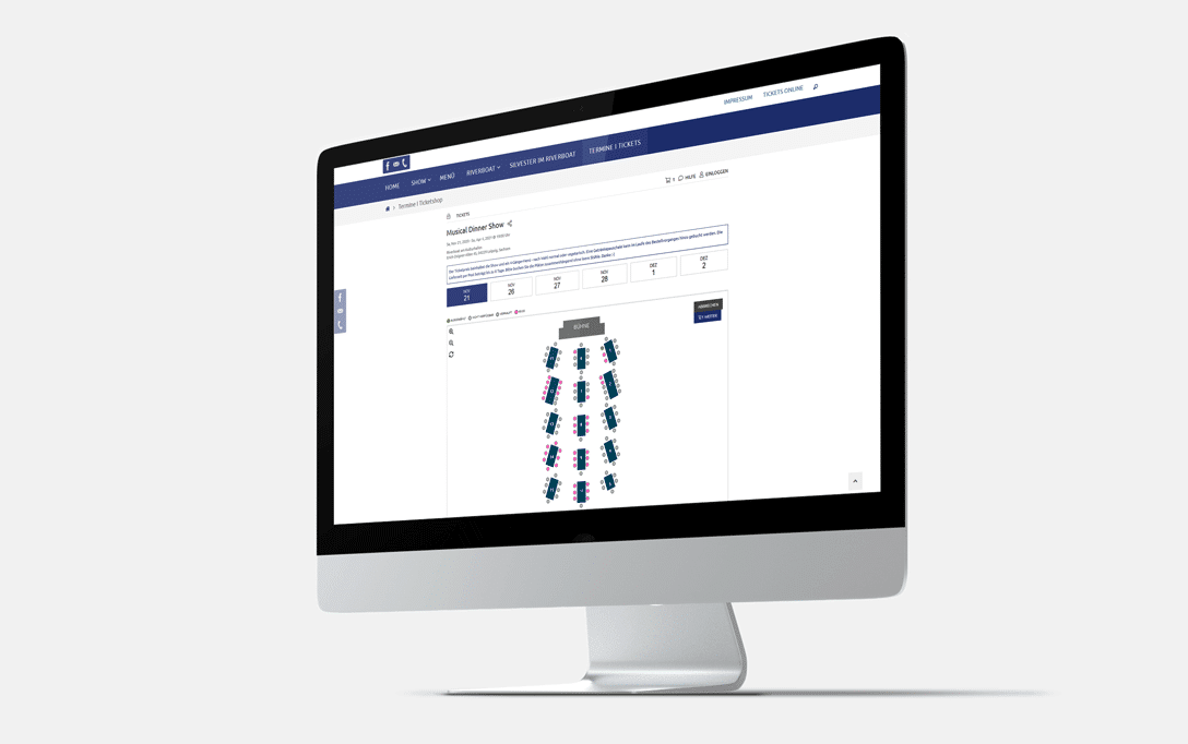
Have you considered setting up your own white-label ticket shop? If you’re still unsure or want to learn more, our blog article explains everything you need to know.
- Why is event marketing so important for ticket sales?
Event marketing is one of the strongest drivers of ticket sales because it builds awareness, trust, and customer loyalty. Through social media, newsletters, websites, and targeted campaigns, you grow your own event brand. These channels often drive more conversions than generic platform recommendations.
- Is a dedicated ticket shop worth it compared to a platform?
Yes—especially if you already have your own audience. A dedicated shop lowers distribution fees, strengthens your brand, and gives you full control over customer data and communication. Ticketing platforms can help reach new audiences, but they’re rarely the main source of conversions.
- How much do platforms charge for ticket sales?
It varies by platform. Many charge up to 20% of ticket revenue in fees—even if the customer was brought in by your own marketing. A dedicated shop can drastically reduce this cost. Plus, it gives you better tools for upselling, loyalty, and direct communication.
- Do platforms really bring more buyers?
Not necessarily. We’ve seen that most buyers come through your brand—via social media or newsletters. In fact, many organizers direct users to the platforms themselves and then get charged for those very sales.
- What’s the smartest ticketing strategy?
A hybrid strategy can be useful. Newer organizers might benefit from platform exposure. But as your brand grows, a direct sales approach via your own shop becomes more cost-effective and builds stronger customer relationships.

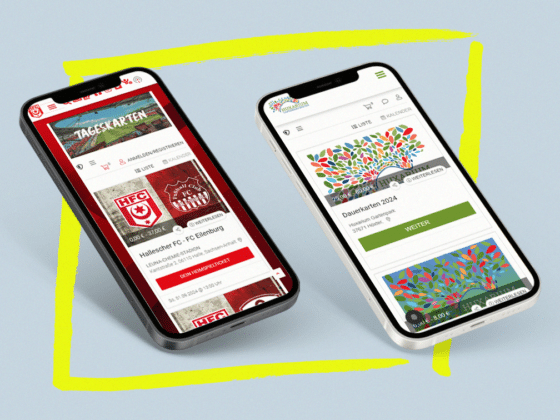
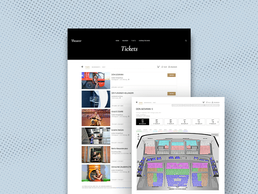
White Label Ticketing: The solution for personalized ticketing systems
READ NOW